For companies using a blog as a way of driving traffic and generating leads, getting an email subscriber is just step 1 of the conversion funnel.
While getting e-mail subscribers is great, the real goal of most company blogs is to generate leads for your sales team or get your prospects to make purchases online.
Excluding customers that purchase outright after landing on your blog, this is how most companies look at the process for converting their blog traffic into customers:

For companies without a free trial (like e-commerce), your funnel to convert visitors from your blog likely looks like this:

Many businesses follow the traditional path of nurturing their blog subscribers over time by emailing good content until they convert into a lead or customer.
This strategy is fine. We do it at SnackNation and it’s a solid way of providing value to your prospects until they’re ready to learn more about your product.
In addition, for more complex purchases or expensive products (enterprise software, large capital expenditures, complex consumer products or services like home renovations or personal training), it’s essential, because the customer doesn’t make a flippant decision, so nurture is required.
Note: For the purpose of clarity, when using the terms “lead” in this post I mean someone who has given you more information that just name and email. For our business, this includes a work phone and company name. Otherwise, I’ll refer to them as an email subscriber or prospect.
But recently, our team started testing a way to shortcut this process dramatically with a simple tweak on our thank you page.
Here’s What We Did to Our Thank You Page
This is a typical Thank You page that most company blogs send you to after you become an email subscriber or download content from their blog:
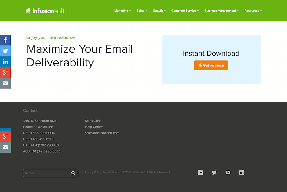 InfusionSoft’s thank you page after I downloaded an ebook about maximizing email delivery
We wanted to test something different. We were curious to see what would happen if we offered our free trial (in our case, it’s a free sample box of snacks for their office) directly on our blog’s Thank You page.
The idea was that when a visitor downloads content from your blog, they’re obviously interested in what you have to say. Why not give them a chance to “upgrade” and try out your free trial?
We first started testing Thank You pages with an offer for our free sample box about 10 months ago and haven’t looked back since.
These Thank You pages alone have brought in 884 leads, from which we’ve closed over 20 sales.
Note: Of these 884 leads, only about 18% were qualified. We get a lot of leads from outside the US (who somehow have phone numbers registered in North America), so those are automatically unqualified because we only ship our product within the US. So if you have a digital product or service, you would probably see a better conversion rate of sales from your leads.
Needless to say, this strategy has been very effective for our business. It has also dramatically shortened the typical time it takes to convert a blog subscriber into a lead for our sales team.
One of the keys to converting on these Thank You pages is to create a “Message Match” between the content that was downloaded and your free trial or product (more about this later in the post). By following this formula, we’re seeing conversion rates between about 7.5-11%.
Now let’s walk through the process of creating these Free Trial Thank You pages.
Step 1: Find your highest trafficked posts and create a content upgrade
By now, I assume you’ve heard about the effectiveness of using content upgrades for list building. Devesh has gone into a lot of detail about them here and outlined how you can scale this tactic.
However, while some marketers like to immediately add a content upgrade for each new post they publish, our content strategy has been heavily focused around SEO. So my strategy has been to wait until we’re getting organic traffic to the post before offering a content upgrade.
Why do I wait to add a content upgrade and sacrifice all those potential email subscribers?
As an in-house Content Marketer, there’s a lot going on. At any given time, you probably have 127 other things on your plate.
While I don’t think it’s a bad idea at all to add your content upgrade right when you publish, I personally like to wait until the post starts ranking for our target keyword and bringing in consistent organic traffic before investing time in creating a nice PDF.
The other advantage here is that if the post is a dud for any reason, I don’t want to waste time adding the content upgrade and configuring all the automation rules that go along with it.
My rule of thumb is at least 50 unique visits to the page/day before spending time to create a content upgrade specific to that blog post.
I’ll keep an eye on our keyword position tracking software and Google Analytics until that happens:

So once I’ve seen a couple weeks of those consistent traffic hills, it’s time to get to work.
There are 3 places I’ll add CTA’s for the content upgrade on a high-traffic post:
- Towards the top of the post between the intro and the body
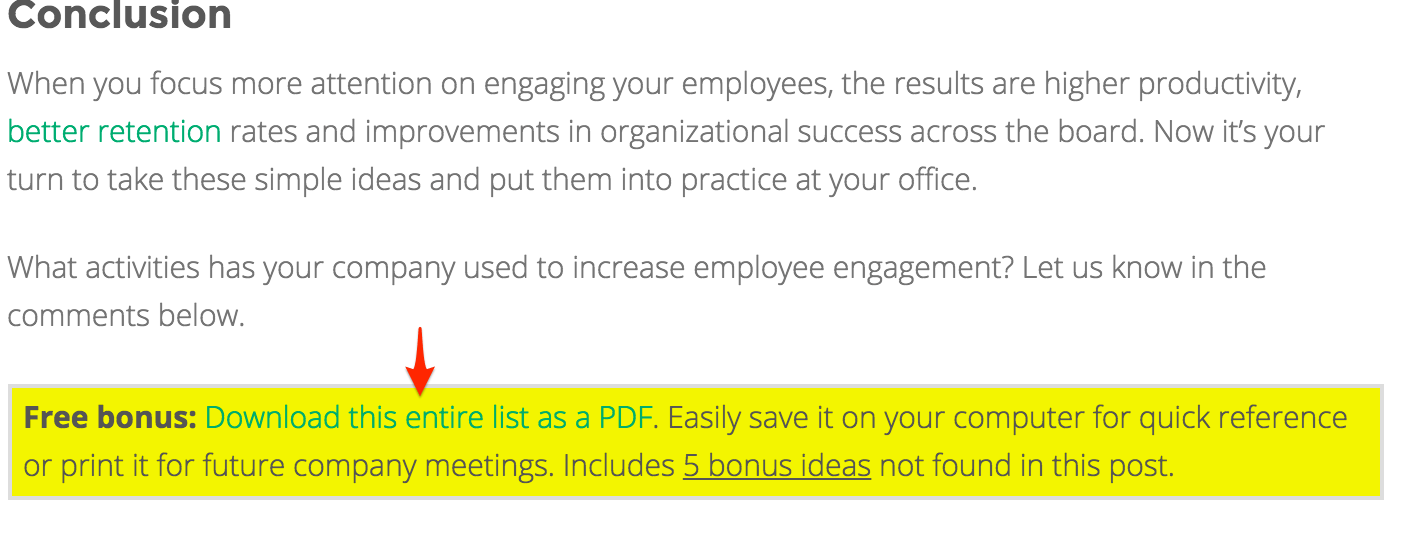
- At the end of the post below the conclusion
- Exit popup
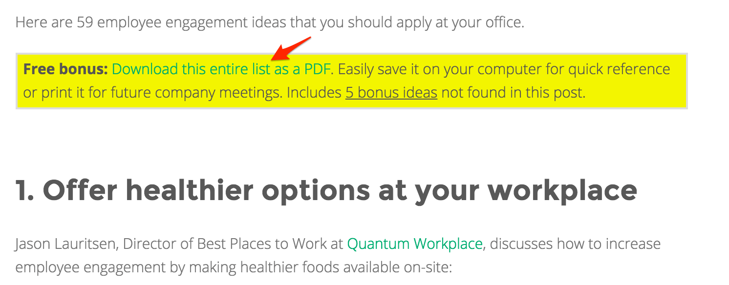
Top of post CTA (thanks to Brian Dean for the inspiration on the CTA copy):
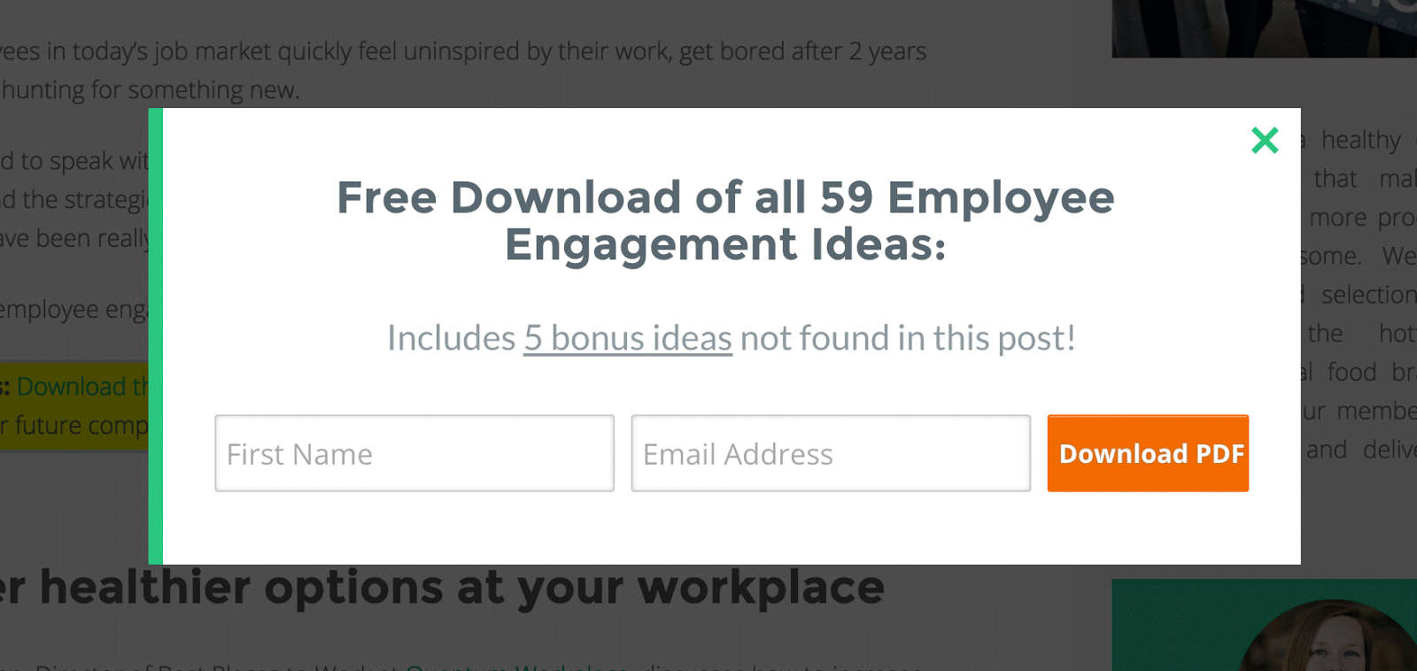
Here’s the popup that shows up when you click the link (as you can see, nothing fancy and it converts 55.98% of visitors who click the link):
End of the article CTA:
Exit Popup:
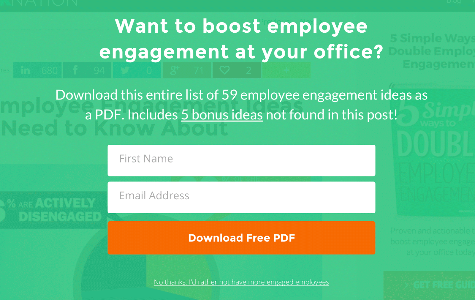
I use OptinMonster for these text link and exit popups, but you can also use a service like LeadPages.
Side note: I’m a huge fan of the full-page exit popup pictured above in green. We used to use standard exit popups for our content upgrades that looked similar to this template:
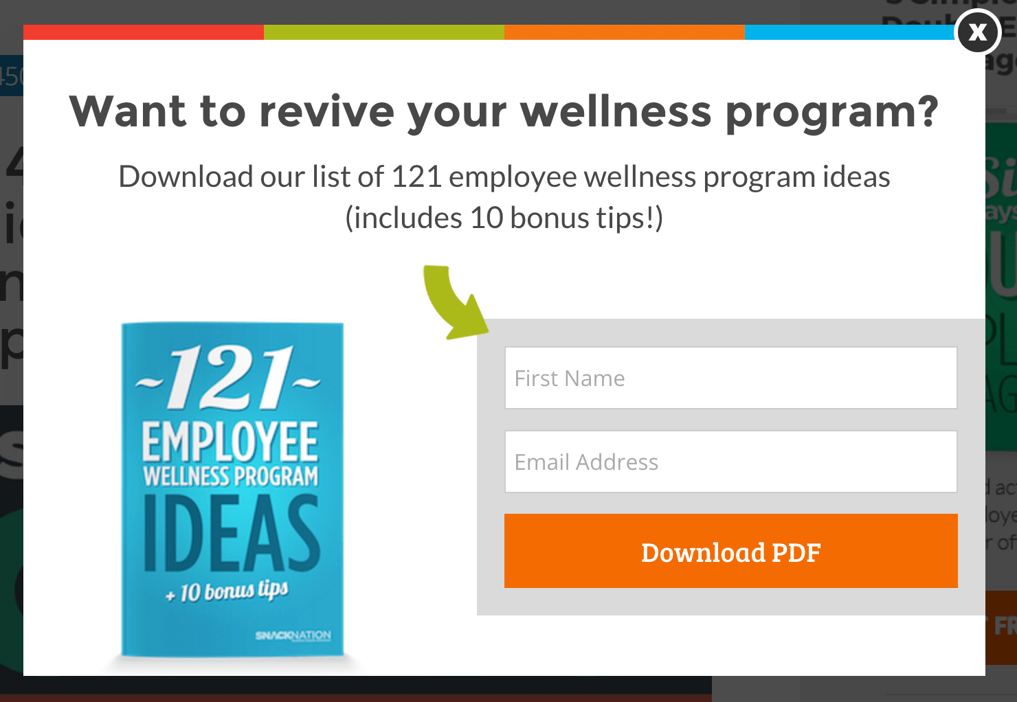
Those popup templates converted at around 2.6%. Since switching to the full-page exit popup, we’ve seen them convert nearly 115% better at 5.58%. If you’re using the standard popup template, I highly suggest testing full-page ones to see what results you get.
Step 2: Use your Thank You page to tie the content upgrade into your product and offer your free trial or sample
If you have a solid content strategy, most of what you write ties back to your product in some way.
For example, at SnackNation one of our top performing posts is a massive list of employee engagement ideas.
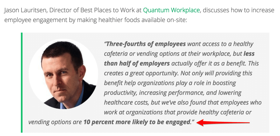
We believe that healthy snacks can be an awesome way to help companies increase employee engagement. One of the experts who contributed to this post even mentioned this connection we’re making and supports it with data:
Now here’s where we do things differently.
After someone enters their first name and email into one of the popups mentioned earlier, they’re directed to a page that ties the topic of the content upgrade (employee engagement) to our product (healthy snack delivery subscription for offices) and offers them a free sample.
Here’s how the Thank You page for our employee engagement ideas post looks:
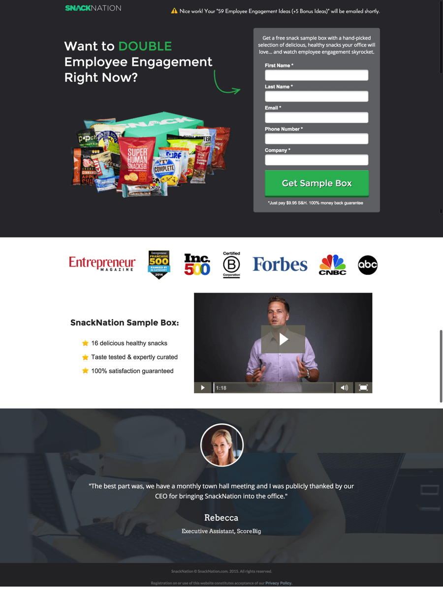
This Thank You page is converting 10.52% visitors into leads for our sales team.

Let’s breakdown the components used on this landing page so you can see how our prospect is able to make the connection from the topic of the content upgrade to our product.
1. Build “scent”
The first thing your landing page needs to do is build “scent” from the previous page:
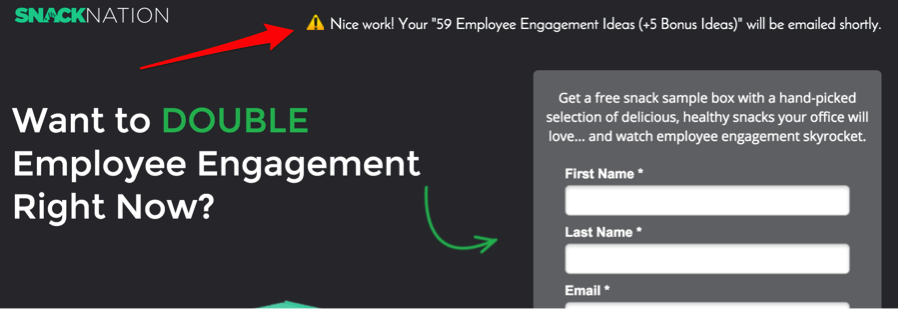
Scent is basically maintaining a similar message as the page from which your visitor came.
We’re calling out the thing they just opted in for and letting them know how they will receive access to it.
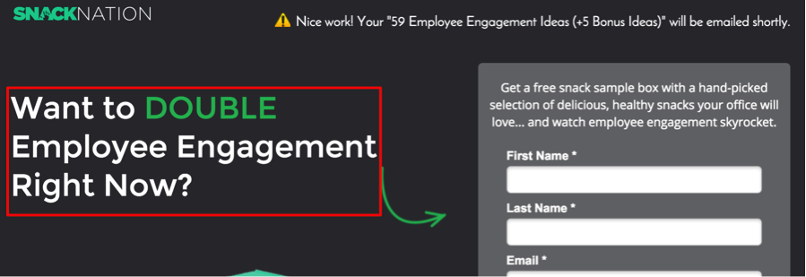
2. Ask if they’re interested in accelerating their results
The next thing you’ll need to do is take the topic of the content upgrade and ask if they want to get results in that area faster, better, or more efficiently:
3. The offer
The last major component of this Message Match Thank You page is the offer itself.
This is where you offer the CTA to get a free sample or trial of your product or service:
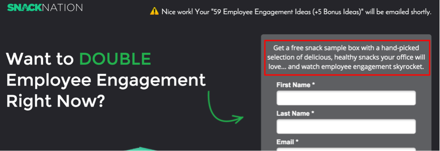
The key here is to show how your product will help solve your prospect’s pain point. Then make it risk-free for them to try it out.
Some other things to point out about this page:
Even though this prospect already gave you their first name and email address, they’re still pretty cold traffic. Use elements of social proof on your landing page to help build trust:
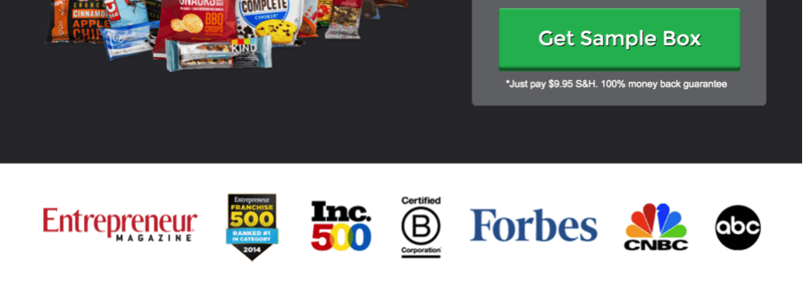
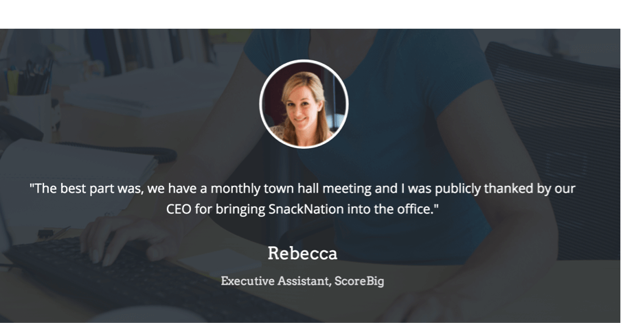
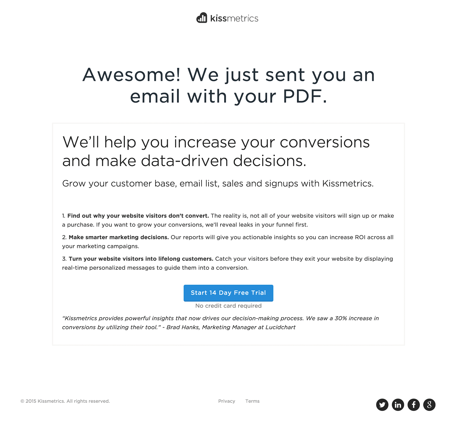
I want to point out kissmetrics because I noticed that they also do a great job with this Message Match Thank You page technique.
After I downloaded a guide on A/B split testing from their blog, I was directed to a Thank You page with a relevant message to take the next step in their funnel (i.e. a 14-day free trial of their software):
Step 3: Rinse and repeat with other blog posts on your site
After we started seeing results with these Message Match Thank You pages, we repeated the process in Step 1 and 2 for the other top performing posts on our blog.
Here’s a landing page we made around the topic of employee recognition/appreciation after someone downloads the content upgrade on this post:
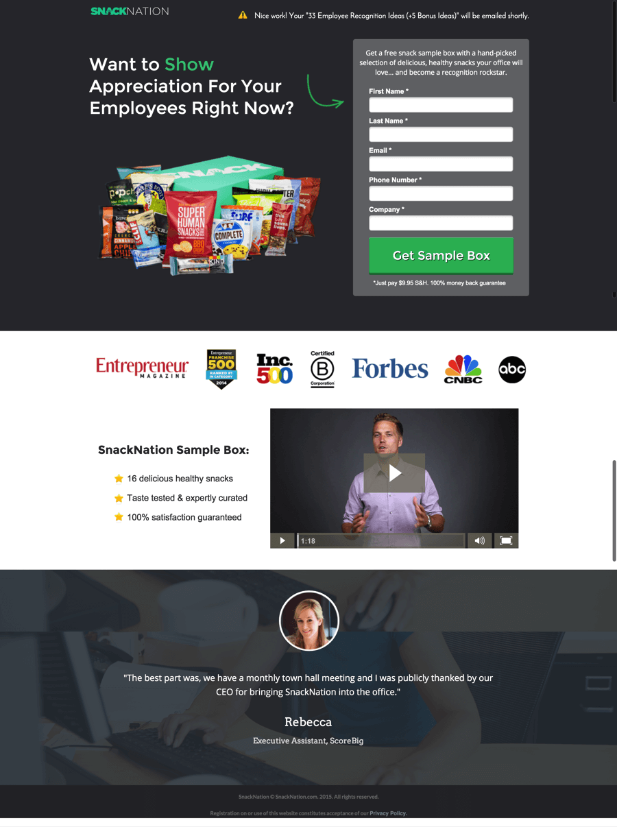
The conversion rate on this page is a bit lower than the one earlier about employee engagement. The employee appreciation landing page is only converting at 7.59%.

Although the traffic and conversion data from this landing page are still a bit low to be conclusive, I can gather a potential hypothesis here. It’s possible we’re not doing a good job of connecting the dots between employee appreciation and a perk like free healthy snacks.
What it could also mean is that these prospects will need more nurturing via content and email before they convert. That’s totally fine and we’ll continue to provide these people with valuable content until they’re ready to learn more about our product.
How to Scale This Process
It would obviously be extremely time consuming to scale this process for every topic area we cover on the blog and every content upgrade we create.
So to help us be more efficient as we scale, I’ve also created a “Catch All” Thank You page. Here’s how the “Catch All” landing page looks:
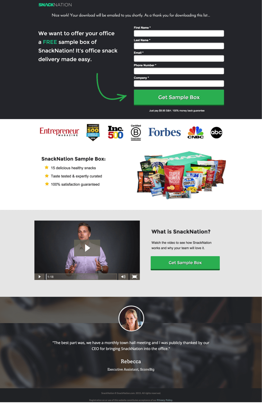
We’ve been using this landing page for higher in the funnel posts that are more of an awareness play like these:
11 Insanely Powerful and Motivational Videos For Your Team
87 Fun Office Activities That Make Work Awesome
What’s been really surprising is that this page without a clear “message match to free offer” is converting at 10.67%.

When looking at improving conversion, it’s easy to look at the top of the funnel conversion rates and call it a winner. What you should do is dig a bit deeper to find out if those leads are converting into sales.
Although this page has a higher conversion rate than the others, it has resulted in a lower percentage of leads that have converted into sales. So we’re getting more people to give us their information to be contacted, but the tradeoff has been lower quality leads.
Can you also shortcut your funnel with the landing page?
My hope is that we’ve been able to show you the difference that a good Thank You page can make for your business. As marketers, we’re all fighting for our potential customer’s attention in a noisy world. So while you have a prospect’s attention and they’re on a high after just engaging with you, see if you can shortcut your sales funnel by giving them a chance to test, sample, try, or learn more about your product or service.
Like anything else with improving conversions on a website, use the tactics you’ve learned here as a starting point but test different messages to find what converts best for your business. Just because something is working for our business it doesn’t mean you will see the same results (for better or worse).
 Emil Shour is the Content Marketing Manager at SnackNation, a healthy snack delivery service for offices across the US.


