Here’s the scenario: You run content marketing for a startup, or a company a little further along. You’re in a management meeting, humbly bragging about how much traffic the blog is getting, and the Founder asks:
“But how do we know we’re making money from this traffic? How much revenue did we generate from it last month?”
You smile calmly at the executive team, and resist the urge to throw your phone at them. You calm down in time to realize you don’t actually have a specific method of quantifying revenue from the blog.
“Damn.”
So you mumble something about how “a fraction of blog traffic clicks over to the homepage, and the homepage converts at 6% to free trial…so…”
But no one seems to be satisfied with this answer, including you.
After some back and forth, you leave the meeting upset.
You’re upset that:
- People aren’t valuing the traffic your blog is generating
- You don’t have a better answer to the question:
What’s the strategy for converting blog readers into customers?
The truth is, you don’t need to fumble over this answer, but if you haven’t thought about it in a systematic way, you will.
Over the next few weeks, I’ll be doing a series of posts about how to convert your company’s blog readers into email subscribers. Today we’ll be talking about the overall strategy and where to place calls to action, so you can have a solid and concise answer when someone asks you how you’re growing revenue.
Overview: The Reader to Revenue Strategy
Here’s a super simple framework for understanding how you’re converting readers into customers.
You convert readers to customers in just 2 ways:
- Through direct links to sales pages
- By capturing reader emails and emailing them.
That’s it.
Once you put your conversion strategy into that simple framework, you can move on to measuring how both funnels are doing and then increasing the conversion rate.
Today, we’ll talk about how to measure the traffic your content is sending your key sales pages, what pages to send traffic to, and the best places to put those links. Where I can, I’ll show you real data from client sites.
How to Measure How Much Traffic You’re Sending to Sales Pages
There’s this funny thing about measuring conversion rates. It’s literally the most important part of this process, but I’m always surprised at how many clients I work with that don’t do it.
They have decent blog traffic but don’t have a clear method of measuring how much revenue is generated from that traffic. They just end up believing that they’re making good money from that traffic.
If you’re running content marketing, vague feelings aren’t good enough to convince your team that you’re getting a solid ROI. And if you’re not measuring things properly, you definitely won’t know how big that ROI is (or if it’s positive).
Once you measure how many customers you’re generating, anyone at the company can see, in plain daylight, how much revenue you and your team are generating. Explaining ROI to bosses will become super simple. Improving performance will become more systematic. And when that revenue number is substantive, the benefit of your team’s work on the company’s top line will be crystal clear. Then you can walk through the office with some serious swagger.
Here’s how you do it.
You will need to implement ‘blog to customer’ analytics. They will need to be simple so that people can:
- Actually use them
- Easily understand them
Step 1: Set up GA goals to count a “conversion”
Note: For our most up to date explanation of how to track conversions, check out our post on conversion tracking in Google Analytics 4.
The easiest way I’ve found to set up a conversion goal is to use a destination goal for the confirmation or thank you page when someone signs up or purchases.
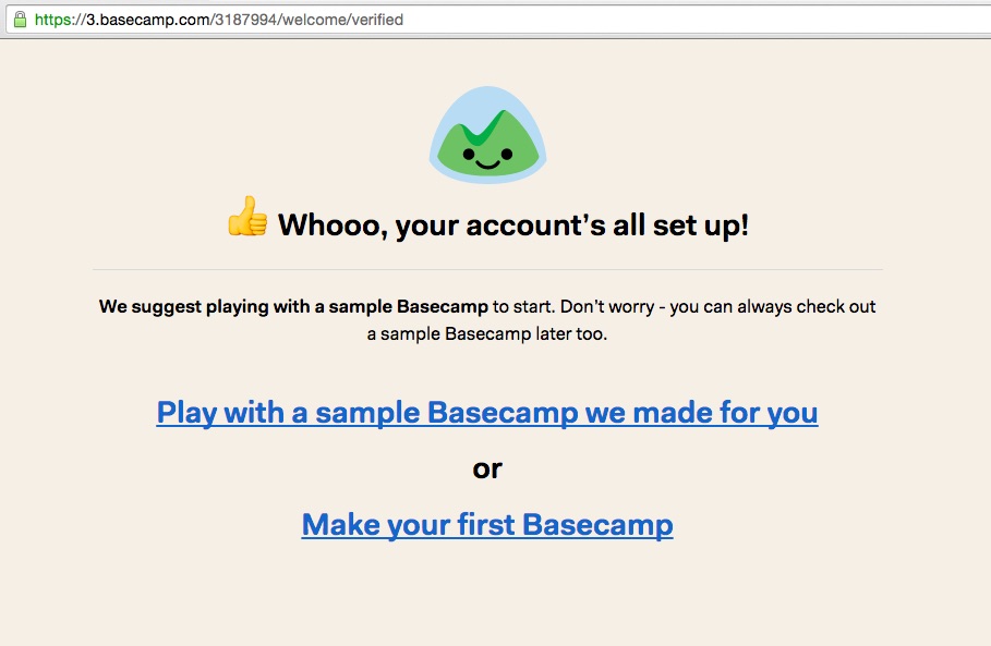
For example: A SaaS site like Basecamp would have a conversion goal that tracks the number of unique visitors that make it to this page:
…which is the success page for setting up an account. One caveat: the url for these success pages can sometimes be a bit unique and even dynamic, but your tech team should still be able to setup the goal in such a way that it measures every signup.
Do this for every conversion you want to track. For example, Basecamp would also have a separate goal for tracking paid conversions (probably a “payment successful” page).
If you run an e-commerce company, you can just use the GA e-commerce integration, which is explained in this video by Google, or this GA help page.
Step 1a (optional): Set up a revenue estimate for that goal.
For SaaS free trials, or or other physical services (like, say, Airbnb) you can also input an estimate of average revenue that each conversion is worth:
Step 2: Use the Landing Page Report to see conversion rates
After about a week of tracking goals, you can use a pre-built GA report to easily see how many conversion events came from visitors who originated on any page: Landing Pages.
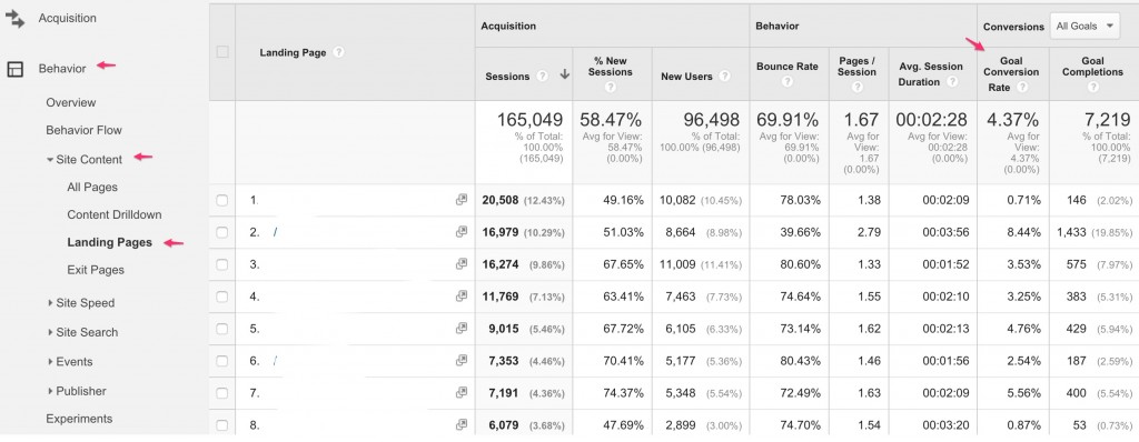
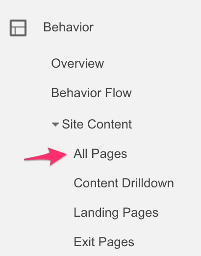
Just to go Behavior > Site Content > Landing Pages, and GA shows the conversion rate, total conversions, and revenue for visitors that land on various pages throughout your site.
Here’s an example from one of our clients who gets over 100,000 uniques to their blog a month:
I’ve whited out the urls for confidentiality, but you can interpret the conversion rate number for each row as:
How many people who entered our site via this URL ended up completing this goal?
If each goal has a monetary value to it, then you’re all set. Now you can show the whole company how many people that entered the site via your blog are converting!
Step 3 (Optional): Use Funnels and/or UTM parameters to show the path people take
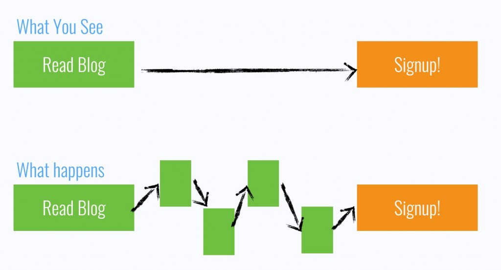
One thing that should be made clear: when you use the landing page report, you don’t get to see the details of the path your readers took on their way to converting — just whether they converted or not:
Of course, after you measure the conversion rates, you’ll want to improve them. And to do that, you’ll need to know what path the readers are taking.
So how do you get insight into the conversion path?
Conversion Path Method 1: Funnels
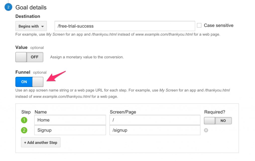
If you know some likely funnels beforehand, then you can set them up when you make your conversion goal, and GA will show you the percentage of people moving through each step.
For example: If you know that basically everyone who signs up for your free trial goes from the homepage to the signup page, then when you setup the free trial goal, you can specify those steps:
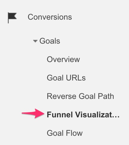
And now you can use the “funnel visualization” report to see what percentage of people make it through each step of your funnel:
What about if there are a ton of different paths people can take to signing up or buying?
For example: In that free trial example, what if you want to see if people first look at a features page, watch a video, or go anywhere else before ending up on the /signup page?
Conversion Path Method 2: UTM Parameters
A useful trick to just get an overall picture of how many visitors to any page came from the blog is to use UTM parameters on all links from the blog to the site.
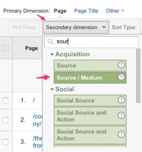
If your blog is already up and running, doing this retroactively can be tedious, but if you do it, you can go to any page and see how many people came from each Source/Medium. You’ll also be able to see the % of traffic that came from your blog:
If you’ve never used UTM parameters before, they look complicated but are pretty easy to setup. It’s really just adding some names to the URL so GA knows where the traffic is coming from.
Step 1: Go to the Google URL Builder
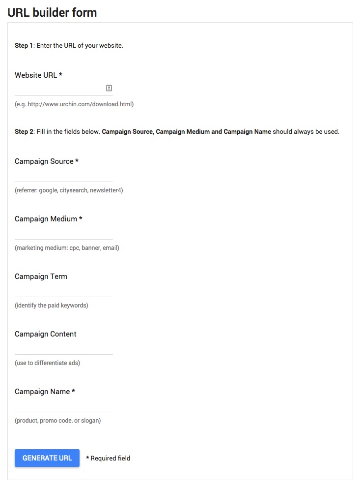
Step 2: Set the “medium” to “blog” (or whatever you call your blog). Set the source to a name that describes which link on the blog this is for (e.g. “sidebar”, “navbar”, “midpost”, “popup”, etc.), and set the campaign to a description of the end goal (e.g. “freetrial”)
For example, here’s a hypothetical URL that we could set up for Grow and Convert, if this was a blog attached to, say, a SaaS app:

Measurement Recap
Here are the steps you’ll need to implement to be able to track purchases that originated from your blog traffic:
- Set up goals in GA. Either manually, or with the e-commerce integration, if you have a store.
- Use the landing page report to see how many conversions came from people who entered the site from your blog (you get credit for these!)
- To see where else blog traffic is going (besides just a few “goal completion urls”), use a simple UTM parameter scheme for all links from the blog
Of course, measurement just sets the stage for optimization, since you can now actually see what effect your changes make.
Note: If you’d like to learn how to attribute leads to content with video examples, we also share this process and more, in our course and community.
Optimizing Your Links to Send More Readers Into Your Funnel
There has been a lot written previously on how to write links so that they get more clicks, so I’m not going to cover that in this post. If you’re curious to see some examples, you can check out:
- This case study where my team added value-based copy into links to double the clickrate.
- Another case study where a signup form was optimized by using more benefit oriented copy
Instead, for this post, I want to focus on: placement of CTAs. The questions you might be asking yourself are: should you use a sidebar form, slider on the bottom right, end of post CTA, or popup?
I’ve found that these more fundamental decisions generally make a more sizable impact in getting readers to click and engage than copy tweaks.
Call to Action Placement: Analyzing where people click
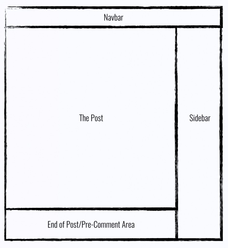
Here’s the typical blog layout:
The question is: Where should you put your calls to action?
Example: A Yoga Store and Blog
For fun, let’s add some context to this discussion, and assume this is a yoga e-commerce site that sells yoga apparel and equipment. As you’d expect, the blog covers all sorts of yoga related articles: poses, routines, stretching, nutrition, equipment, meditation, etc.
The conversion path for a reader is pretty straightforward: You’re reading about yoga moves, you’re therefore obviously into yoga (or trying to learn) — you may need yoga mats, blocks, belts, or clothes. If you do, the store hopes that you buy it on their site instead of Googling or going to your local brick and mortar.
That’s the conversion goal: Get readers to click over to the store and buy right now. Or get them to join an email list so you can keep reminding them to get their pants at your store instead of Lululemon.
To do this, let me walk through a list of possible ways to present your call to action, and provide some data from an actual case study to see which ones convert well and which do not.
Exploring Placement Options for your CTAs and their Pros and Cons
Here are the different options covered in this section and rough conversion rate ranges I’ve seen for email capture forms in each of these locations:
- Sidebar CTAs: 0.5% – 1.5%
- Generic end of post CTAs: 0.5% – 1.5%
- Pop-ups: 1% – 8%
- Sliders and bars: 1% – 5%
- Welcome Gates: 10% – 25%
- Featurebox: 3% – 9%
- Navbar: Varies
(If instead you’re just linking to a page, expect higher rates.)
Let me state one conclusion upfront — just so you’re on the same page as me while reading this section: Pop-ups, welcome gates, and some other schemes routinely convert in the mid to low single digit percents (2% – 6%). So, I often refer to sub 1% rates (e.g. a typical sidebar newsletter form) as a “low” rate. What I mean is, low relative to other options you have.
Final Caveat: Take all of my numbers with a grain of salt. It’s just what I’ve seen for blogs in certain niches with about 2,000 – 150,000 uniques per month. Websites are like snowflakes…etc. etc….you get it.
On to the good stuff.
The Sidebar
Blog sidebars are the single most common place that companies put CTAs to try to convert people.
Think of the laziest optin forms you’ve seen (“Join our newsletter”. Yay, sounds exciting…said no one ever), they are almost always in the righthand sidebar.
But how well do they actually convert?
For blogs that put email opt-ins in the sidebar, I typically see conversion rates around 0.5% – 1.5%, depending on the traffic of the site.
For example: A business and startup blog that I worked with got around 11,000 uniques a month. They had a sidebar CTA promoting an ebook that got a 0.95% a click through rate.
In the above example, the company also had a bunch of other widgets in the sidebar which distracted visitors from converting on that one CTA. One way they could’ve increased their CTA is to put only one CTA in the sidebar.
For example: Another business and marketing blog, Videofruit.com, only had one CTA in the sidebar (an image promoting some free material) and that one image got a click through rate 1.64%, which is the highest that I’ve seen for sidebar CTAs.
Sidebar Recommendation: So, my recommendation for most blogs is to put a CTA in the sidebar — just make sure not to add too many other widgets in there. And don’t worry about A/B testing it unless you have a lot of traffic (100,000+ uniques/month). If you get a 50% uplift from an A/B test on a 0.5% baseline, you’re only converting 0.25% more.
If you do have significant traffic to your blog (100,000 uniques/month or more), I definitely recommend a clear, simple call to action in the sidebar, because 0.5% of 100,000 is 500 clicks/signups per month, which adds up. Again, the more other clutter you remove from the sidebar, the better.
Finally, for folks that want to focus on higher converting items, early experiments we’ve done have suggested that eliminating the sidebar can increase overall engagement rates on other, higher click rate CTAs.
For example, we have no sidebar on this blog because we want to focus on the content and our e-mail opt-ins are converting at a pretty solid rate so far.
Generic End-of-Post Calls to Action
There’s this phrase that people always use to explain why the end of a post is the best place for a CTA:
If the reader made it to the end, they want more stuff from you. So give it to them!
That sounds nice, and probably has some truth to it, but from what I’ve measured, generic end of post calls to action convert just the same as the sidebar: around 0.5% – 1.5%
This is typically because most people don’t make it to the end of posts (or any web page for that matter), so calls to action at the top of posts are more effective. In fact, with a client of ours, Backlinko, we found that posts where he placed certain calls to action in the top and bottom converted around 300% better on average than posts where it was only at the bottom.
Another thing to keep in mind at the end of a post is that there’s often a variety of things the reader is asked to do:
- Join our email list!
- Share this on social media!
- Leave a comment!
- Sign up for a webinar!
It’s overwhelming. Distraction is a well known conversion killer, so…
End of Post Recommendation: If you want, put a simple call to action to click to your store, app homepage, or features page. But if you already have a bunch of calls to action at the end of the post, just skip adding another one and move on to bigger wins. If you can avoid a bunch of asks, it will help keep readers coming back long-term.
One last note: In the example above, I’m referring to generic end of post calls to action. Things like: “Like this content? Sign up for our email list!” “Check out our store!” etc.
I’ll do an entirely separate post on content-specific calls to action, which can be placed at the top, middle, or end of the post and convert an order of magnitude higher. If you’re curious now, you can read more here. Or if you want to make sure you get the follow up post that will discuss this, you can join our email list here.
Pop-ups
I’m just going to cut to the chase. Pop-ups convert.
I know, people are afraid it will annoy readers or reduce engagement, but over and over again I’ve seen pop-ups reach conversion rates that common sidebar and generic end of post CTAs just don’t reach.
Let’s see some examples.
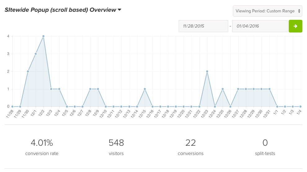
First, let’s start close to home. This blog’s generic, site-wide pop-up is triggered when someone scrolls halfway down a page. This pop-up is converting at 4.01%.
Think about that compared to sidebar and end of post opt-in rates. If those convert at 1%, and that’s considered “good.” This pop-up is converting at 400% higher (that’s why we have forgone the sidebar altogether and instead focused on these higher converting tactics).
These numbers aren’t just representative of a site with lower traffic. For an SEO blog that gets 100,000+ uniques a month (with the largest chunk being organic search), their generic site-wide pop-up converted at 3.31%
There are only a few triggers for a pop-up: timed, scroll, or exit intent (I’m excluding a manual link to a modal, which is a different concept). If you’re concerned about annoying readers, simply try an exit-intent trigger, which is less intrusive than a timed or scroll-based trigger. I haven’t seen much evidence of pop-ups reducing SEO rankings or increasing reader complaints. For example, on this blog, we have a scroll-based trigger for our site-wide pop-up and it’s converting well (4%) and readers are consistently responding to our welcome email positively.
Pop-up Recommendation: Use them. You can use them in two ways:
- Direct readers to an app landing page, e-commerce product page, or your homepage to get them in your main funnel
- Capture their email — which is one of the highest converting marketing channels around
Sliders and Bars
This is a more subtle cousin of the pop-up. A simple bar appears at the top or bottom of the page:
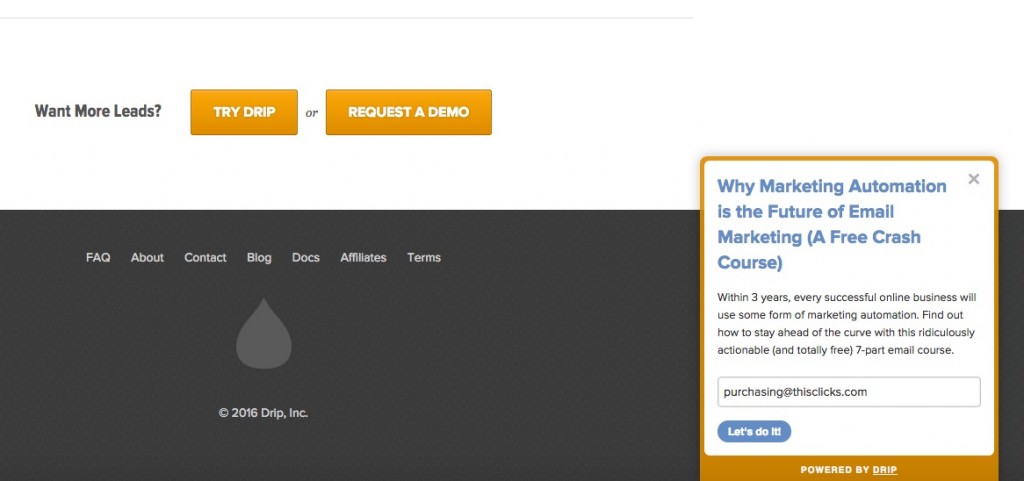
Or a slider appears in the bottom right or bottom left corner of the page (usually after scrolling for some time):
Slider conversion rates are generally lower than pop-ups. But if your slider is large and compelling, it can approach the same conversion rates as pop-ups (low single digit %s).
As for simple “Hellobar style” top-of-page CTAs, in my experience, they generally convert in the 1% range — so not quite as high as pop-ups. If you don’t make the CTAs stand out, your conversion rate might be even worse than 1%.
Slider and Bar Recommendation: You can experiment with these in addition to an exit intent pop-up, or if you have good design and copy, potentially in place of one. My only concern here is to be careful about making the reading experience too intrusive with too many items coming up and covering the content (e.g. I don’t recommend using both: a timed pop-up and a timed slider. But a slider that shows up at the end of an article and a pop-up on exit intent is manageable).
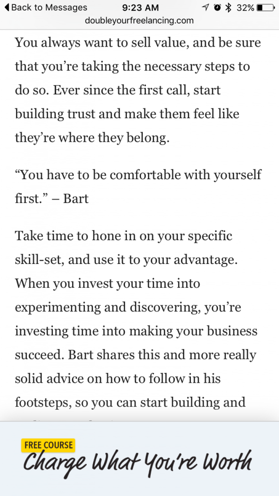
Good for Mobile! One good use for “smart bars” is on mobile. Pop-ups on mobile are really annoying and their conversion rates are often really low. But having a slider at the bottom that lets you keep reading content, but promotes a product page, or landing page on a specific topic, is a good way to get mobile traffic to engage further with your brand.
For example, check out how non-intrusive the mobile version of the bottom-of-page bar from DoubleYourFreelancing.com pictured above:
It’s not garrish. You can keep reading without getting annoyed. But it still promotes the top of their funnel: getting readers into their free course.
Welcome Gate
Welcome gates are aggressive, but they convert like crazy. Let me show you what I mean.
Andrew Warner has a very popular blog/podcast called Mixergy, and if you go to Mixergy.com, this is what you get:
Now, you can scroll to the bottom and click into his site, but previously you had no option but to either close the window or signup.
Does this probably annoy visitors? Yes.
Does this convert well? Definitely.
I’ve seen homepage gates convert from 15% up to 25% of traffic into email subscribers.
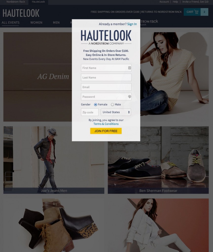
And it’s not just for blogs. The ecommerce site HauteLook (acquired by Nordstroms) for the longest time had a homepage gate that you could not “exit out of”. So you literally could not shop without signing up:
That’s gutsy.
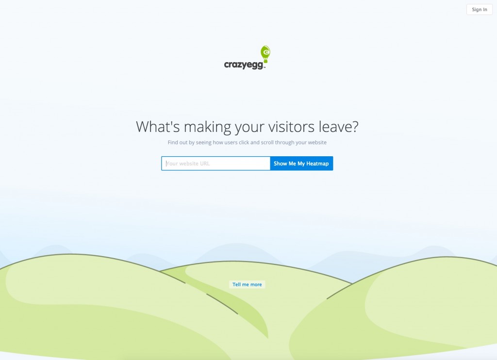
In SaaS, the heatmapping company CrazyEgg puts a twist on this concept by getting you to interact with their app (as opposed to signup) with this homepage, which is very unique compared to the usual “Let me tell you about all of our features!” homepage of most SaaS sites. (Note they do give you an out here with “Tell Me More”)
Welcome Gate Recommendation: If you are serious about conversions, you should use them. But let me also say that I have a mixed relationship with welcome gates. On the one hand, the conversion side of me loves how well they convert — they work like a landing page because you remove all distractions, and have one clear goal as a user.
But the other part of me worries that I might lose a key client because they aren’t ready to give us their e-mail yet, and we’re not giving them a chance to scroll through our site and get to know our company. That’s the reason you don’t see one on this site or my agency’s site.
Featurebox
This is a “welcome gate lite”. The phrase was coined originally by Derek Halpern of Social Triggers and refers to just having a nice above the fold section of your homepage, or even on every article page, that is dedicated to promoting your email list or store/app.
It serves two purposes:
1. To explain what the heck this site is about
2. To convert visitors.
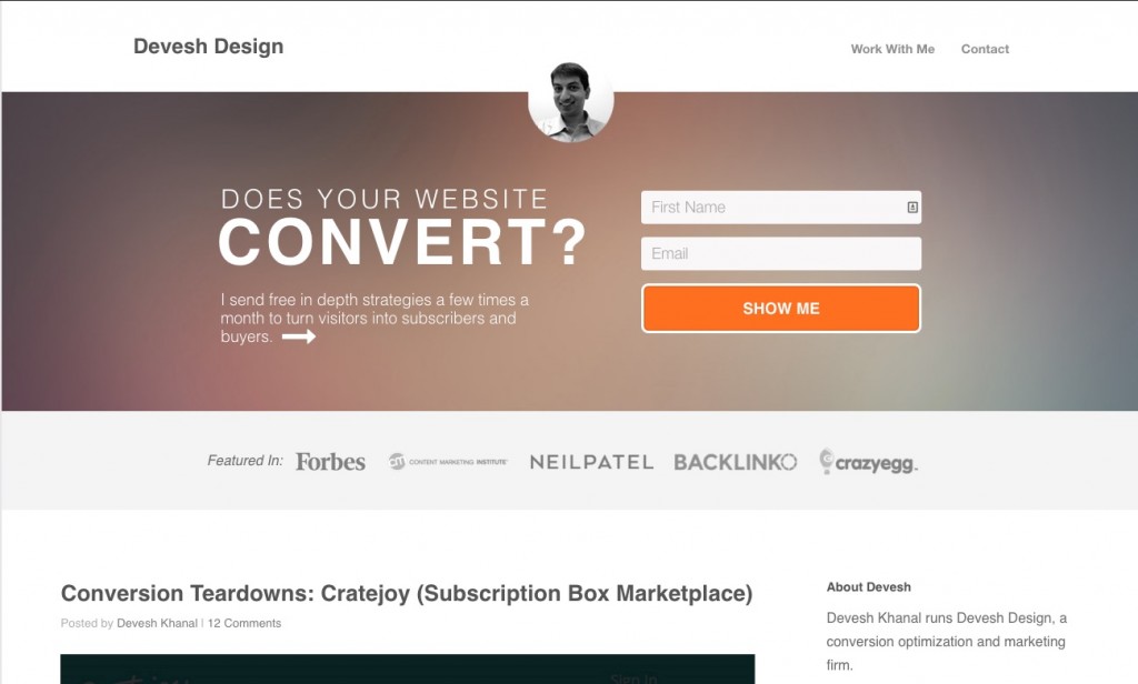
As I alluded to above, in lieu of a welcome gate, I have a Featurebox on my agency site’s homepage:
As a result, my homepage consistently converted around 5% of visitors throughout 2015:
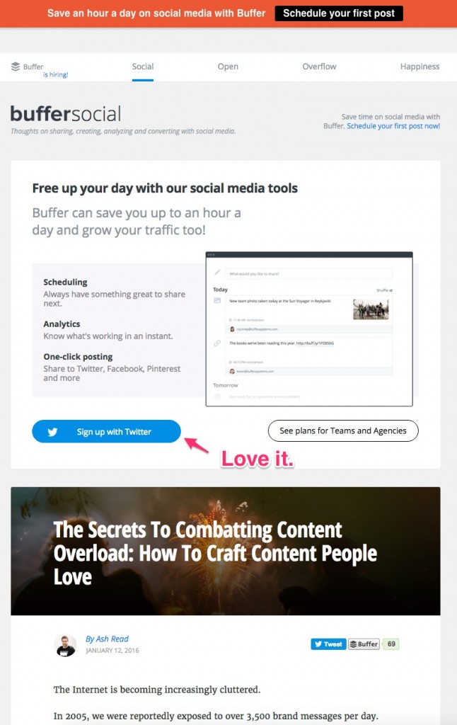
For SaaS businesses, you can even do something similar to what Buffer does and let people signup for the app right in the featurebox (brilliant):
Featurebox Recommendation: Use a Featurebox if you’re interested in driving blog traffic to your main site with the goal of having a user sign up for something, or make a purchase. This is a perfect place to explain what your company offers and provide a simple link to your homepage or landing page.
Depending on the size of your featurebox and how aggressive you want to be, you can have this just appear on your blog’s homepage, or on every post. For this blog for example, it only appears on the homepage.
Optimized Navbar
I’ve saved one of the most fundamental CTA areas for last: the navbar.
Don’t ignore the navbar. Why? Because familiarity is how we like to browse sites now, so if we want to go somewhere, the first place we look is the navbar. So the psychology here is different than tactics like exit intent pop-ups, which are trying to persuade people who are about to do one thing (leave) to do something else (sign up). Instead, here you are:
- Making it easier for people who are trying to click to an additional page to find it
- gently guiding them to where you want them to go.
Obviously, you have a navbar, so let’s get straight to recommendations:
Navbar Recommendations
Here are strategies to use the navbar to drive more blog readers to become customers or subscribers.
- Make the navbar sticky: So when you’re reading, it stays there and encourages more clicks. The last thing you want is for a blog reader to just skim an article and leave. (In case you weren’t sure, that’s the definition of a bounce). Having a sticky navbar helps encourage learning more about the company.
- Remove clutter: Remember that unlike homepage visitors, a lot of blog readers have no idea who you are, they just clicked on an article that ranked for their search term or was on their social feed. So, links like “Team” and “Login” don’t apply to blog readers. Even “features” and “testimonials” can be less appropriate than just sending readers to a dedicated landing page or homepage.
- Choose the logo link carefully: Some companies link the logo to the blog homepage (often because the blog is a separate WordPress install and does that automatically). But most users click the logo to learn more about the company itself. So it makes more sense to send them to the homepage or a key overview page where they can start down your funnel.
- Have another key link besides the logo: Send this to a signup page, a featured product or category, or a recent promotion. Make the link stand out with a different color or a border. This will drive more curious, engaged readers to where you want (instead of making them figure out out on their own).
In my experience, the percentage of users clicking on links in navbars varies wildly. I’ve worked on a blog where 7% of readers click on its logo (around 20k uniques/month, great content, very few distractions on page), and another that had 0.9% click on the logo (around 200k readers, decent content, some distractions). So you’ll need to measure it yourself. But with navbar optimization, remember you aren’t trying to get people to switch their action, you’re getting readers that are already interested in exploring more (good sign!) to go to the correct places to start down your funnel.
Content-Specific Conversion: Coming Next
Next up, I’ll talk about a method to dramatically increase conversion rates regardless of which tactic above you’re using: tailoring calls to action to the content on the page.
If you want to get notified when that post comes out, simply click here to sign up for our email list.
Any questions on these conversion tactics? Ask in the comments!
Join the G&C Content Strategies Newsletter
We send in depth articles about content marketing about once a week. No list posts, no high level stuff.
It's free and marketers at companies such as Salesforce Desk, PayPal, and Cisco have joined.


